Rollercoaster intensity ranker
We all have our limits for theme park rides. Some roller coasters and thrill rides are too intense for us, but some can feel very underwhelming. Certain theme parks give a ‘thrill rating’ or something akin to it to rate the intensity of the ride, but this rating is not universal and often mismatches with our own personal opinions. As an avid theme park fan, I decided to develop a way of objectively rating the intensity of theme park rides using a mobile application called Phyphox.
Phyphox is a smartphone app that provides accelerometer data from your Iphone’s IMU and outputs the data in CSV files. This makes it very easy to analyze in program like MatLab. For this project, we spent the day at Pittsburgh’s Kennywood Park and recorded data from over 10 rides. The data was then exported to MatLab for analysis. Using various numerical methods, each data set was analyzed and given an ‘intensity’ score.
For the purposes of explaining the Matlab algorithm, we will be following the data acquired and calculated from the ‘Black Widow’ ride at Kennywood, however this method applies, and in some cases is dependent on, the other rides that were recorded.
Phyphox provides acceleration data in the x, y, and z directions, dependent on the placement of the smartphone, along with absolute acceleration, which can then be fed into Matlab as data points. Absolute acceleration is used for this algorithm, as the position of the smartphone across members of the team was not consistent, and thus the effects of x,y, and z accelerations are all equally important to rate intensity.
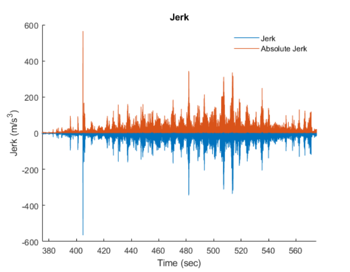
We then derive an plot of jerk versus time by subtracting a point of acceleration from the one after it, divided by its time interval (da/dt). The maximum and average values of this plot will be used to influence the rating of the given ride.
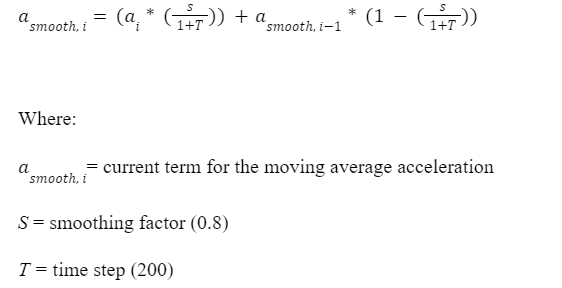
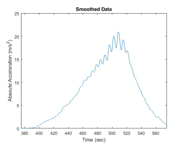
Curve smoothing is then applied to the absolute acceleration plot to simplify the data and allows it to be manipulated more easily. The equation for curve smoothing is an exponential moving average.
An exponential moving average is a rolling average dependant upon a smoothing factor. A high smoothing factor results in less smoothing and thus high responsiveness to variations in the data. We used a smoothing factor of 0.8 which got rid of the majority of the noise but still allowed us to determine acceleration peaks corresponding to drops and loops on coasters. A time step of 200 was also chosen through trial and error – a smaller timestep results in a less smooth, but more accurate plot.
A smoothed graph provides a preferred data set for further calculations and gives an overall better concept of the state and intensity of the ride, removing large outliers like spikes in the data that may occur through an error in recording. From this plot, we can find the average and maximum acceleration, as well as specific points of interest within the ride such as drops and loops.
We also calculate the root mean squared of the data to represent a given ride’s ‘shakiness’. For example, a wooden, bumpy roller coaster will have many more vibrations than a smoother, steel roller coaster.
Finally, we normalize each variable in relation to every ride’s value of that variable. A vector exists for each variable, and a relative scale is created from 0 to 1, being the minimum and maximum of that variable for all rides in the set. This allows the accurate representation of the weighting of each term in our final score equation, so as to not let a less influential term of greater magnitude influence the final score more than it should.
Score = ((Jerkavg * 0.3) + (Jerkmax * 0.2) + (aavg*0.7) + (amax * 0.5) + (section*0.2) + (Vibrationavg * 0.2)) / 0.21 (2)
Each variable is assigned a factor of relevance based on how important its magnitude is to the overall intensity of a roller coaster from our personal experience. For example, the average acceleration is the most relevant variable in intensity, thereby receiving a factor of 0.7, whereas vibrations and sections are not as relevant but still important, receiving a factor of 0.2. These values, along with the dividing factor, were tuned on trial and error based on the data we received, working towards a scale of 1-10 for each ride.
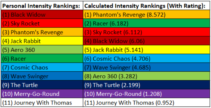
The figure to the right compares our personal intensity opinions with the outputs of the algorithm. We can see that the results from the algorithm roughly correlate to our personal predictions, with a couple disparities, the most significant being its score for Racer. Overall, these results show that accelerometer data can be correlated to ride intensity. Given more time, we would refine our algorithm, and adjust the weights of each factor based on human biology. We would also do more analysis of the accelerometer data in the frequency domain.